


Artistic References
- 9 feb 2017
- 2 min de lectura
First Reference: The day that the crayons quit by Oliver Jeffers
It is my first reference because the book contains big, disorganized and careless drawings which are my favorite due to the time and focusing i require to make them look good

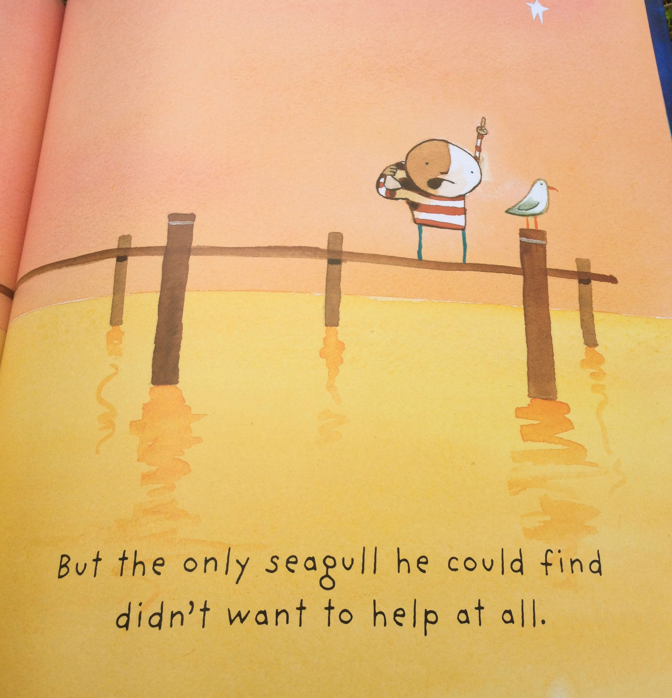
Reference Two: How to catch a star by Oliver Jeffers.
I choose this book because the way he author and illustrator draws and imagines the landscapes, i chose these book too because my target audience for my cover are children and this is a children's book. The landscapes of these book are simple but look complicated at the same way, he combines the colors for the landscape to obtain different tones of the same colors while it goes to the upper or lower part of the drawing, he uses simple shapes to symbolize things like for example reflect water or when the ocean meets the sky and Oliver has sometimes the same characteristic from fauves like André Derain, which it to use different colors to represent objects, for example when he painted the water with yellow instead of with blue, but uses some shapes to make it look as water.


Third Reference: Jesús Abad Colorado
I chose this work because it represents a conflict using only symbols of war, instead of using blood and showing the killing people. I chose it because it represents a group of people with some (5) members and thats what i want to do with my work by using a small amount of individuals to represent an army of four countries. I like very much this work because it shows a war or conflict in a passive way using symbols that in this case are guns and uniforms of the armed groups of Colombia

References:
http://www.elmundo.com/portal/cultura/cultural/latinoamerica_pinta_sus_conflictos_en_el_arte.php#.WK5O0RTLb9A
Comentarios